VideoAppShack: Brand
Branding is incredibly important for a company. It gives the company a chance to influence it's public perception. It's an asset that's intangible but is often a company's most valuable.
It has an interesting origin, coming from livestock branding which was used to differentiate one farmer's cattle from another.
As VideoAppShack is an internet company the branding will be the first point of contact for many potential customers. Whether they come across a banner ad on a website or a retweet in their Twitter stream.
I want the brand to project professionalism, yet come across as lighthearted. As we're a new company that consists of young professionals I want to have a confident yet informal persona in hope that we can build strong, congenial relationships.
There's nothing worse than coming across a brand that mismatches it's product.
Defining the brand
VideoAppShack helps video content producers deliver their content to their audience. For them, their viewers are the be-all and end-all of their business. We aim to improve the experience on both ends by enabling the creation of high-quality video-centric apps.
For that reason, we must remain personable yet professional. Our brand should appeal to both clients and consumers, and our clients as content consumers themselves.
Aesthetic
Visually I want the branding to reflect current trends in the mobile market. Recently both Android and iOS have undergone huge visual overhauls. Apple moved away from skeuomorphism to a more futuristic interface combining flat surfaces and depth of field. Android has had a flat aesthetic for a while, but recently introduced a visual language called Material Design that focuses on consistency and interaction.
Logo
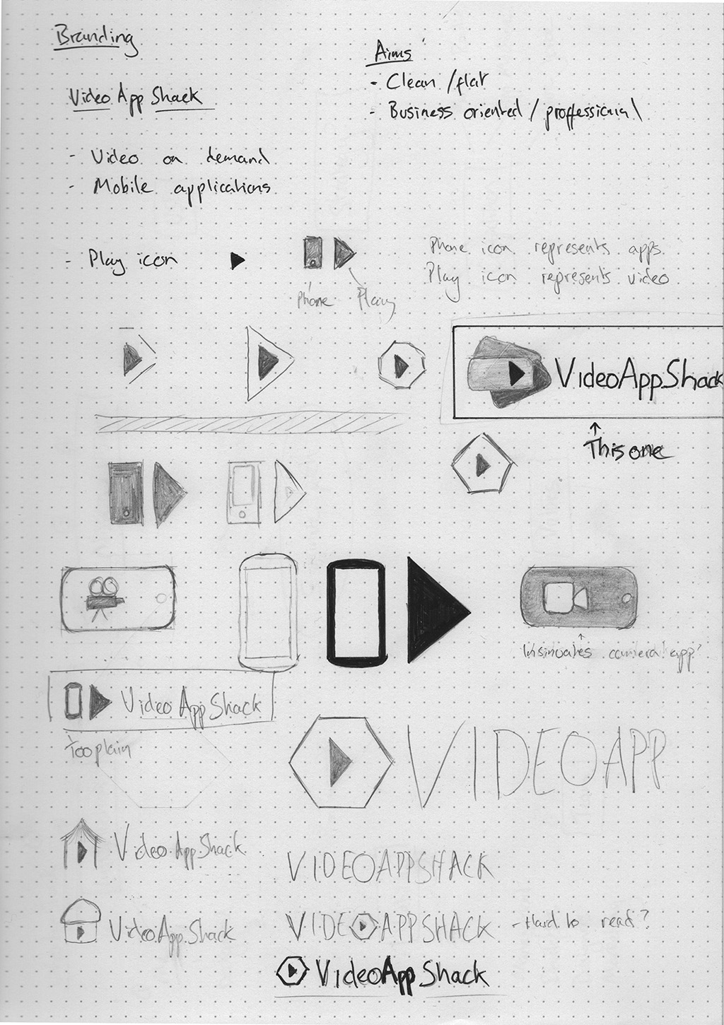
I had a pretty clear idea of what I wanted the logo to look like from the outset. I wanted it to look clean and identifiable, and I wanted to incorporate a symbol to denote the video focus of the service.
I spent some time brainstorming and sketching ideas. I initially wanted a very minimalistic play icon inside pentagon/hexagon outline but once I had these on paper they didn't really appeal to me.
    <figcaption>
        Initial sketches
    </figcaption>
</a>
Eventually I settled on an idea that I was extremely happy with and transferred the idea to Illustrator. I chose a font that looks clean and modern then created three different combinations using different accent colours and slightly different type styles. The name VideoAppShack is formed of three words with the spaces removed and I wanted to increase legibility by playing with the text style.
    <figcaption>
        Experimenting with colours and text styles
    </figcaption>
</a>
The combination of blue and having App in bold was my favourite. This was backed up when I asked a number of people for their opinion.
From there I created a few variations for use in different contexts and finalised the brand colours.
    <figcaption>
        Final logo
    </figcaption>
</a>
    <figcaption>
        Logo variations
    </figcaption>
</a>
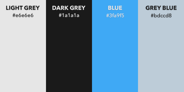
    <figcaption>
        Colours
    </figcaption>
</a>
User Experience
For an interaction based application, user experience is a significant part of the brand. The way your users feel when using your product directly affects their perception of your company.
For example Stripe, who offer a set of tools to integrate payments into your product, has an incredibly nice user experience. They use animations and motion interactions to instill confidence and make the user feel comfortable using their products. Their attention to detail on interaction makes you feel that other areas of their product have received the same treatment, or better. Here's an interesting article about their use of animations.
Materials
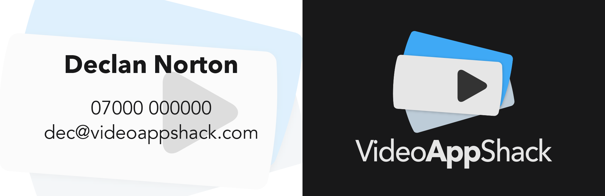
    <figcaption>
        Business Card
    </figcaption>
</a>

    <figcaption>
        Letterhead
    </figcaption>
</a>
Website mockup
Video ident
Marketing
- Instead of offering special offers or discounts, provide materials that help the user use and get to know the product, such as a week long period where tutorials are posted each day.